Analysis Results
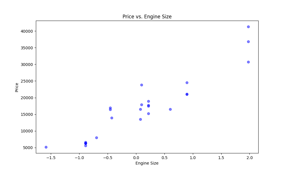
Scatter Plot - Price vs. Engine Size
A scatter plot is suitable to show the relationship between two continuous variables, in this case, the price and engine size of cars.

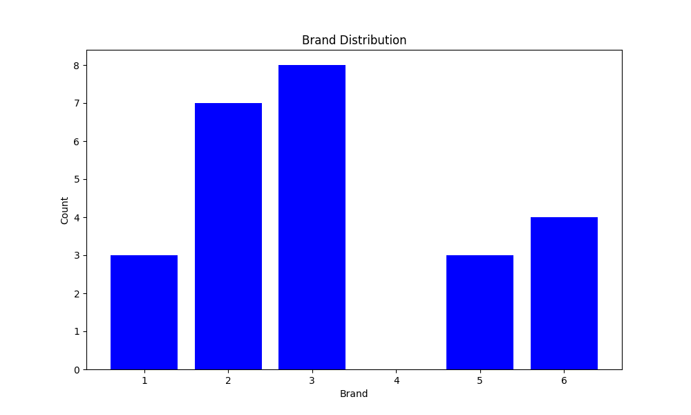
Bar Chart - Brand Distribution
A bar chart is suitable for displaying the distribution of categorical variables, in this case, the distribution of car brands.

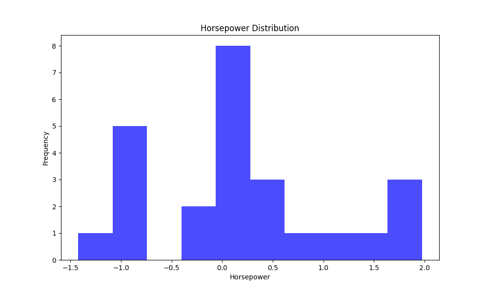
Histogram - Horsepower Distribution
A histogram is suitable for visualizing the distribution of a continuous variable, in this case, the distribution of horsepower values.
